Modernizing the OMERS brand to strengthen talent attraction and alignment
Led a purpose-driven brand evolution that refreshed OMERS’ identity, improved delivery speed, and helped position the organization more clearly for current and future talent.
2023-2024
OMERS' Pension Plan
OMERS is a Canadian institutional investor that provides pensions to municipal employees and manages over $100B in assets.
Talent Attraction
Cross-Team Alignment
Design Systems
Outcome
Refreshed the OMERS brand into a more modern, scalable system that improved speed to market, strengthened employer brand perception, and gave teams a clearer way to communicate.
Why It Mattered
The existing brand no longer reflected the energy, ambition, or values OMERS wanted to project. To attract stronger talent and communicate more effectively, the brand needed to feel more current, purposeful, and usable in practice.
Results
-
20% increase in high-quality job applicants
-
30% faster asset delivery
-
Improved employer brand perception
-
Stronger adoption across teams and channels
-
A more modern and consistent brand experience

OMERS UNiTE Town Hall 2024 unveiling of corporate brand evolution
Overview
OMERS needed its brand to feel more current, purposeful, and competitive. The existing identity still had recognition, but it no longer fully reflected the organization’s ambition or helped it stand out clearly to the talent it wanted to attract.
I led a purpose-driven brand evolution focused on modernizing the identity in a way that improved perception, supported internal teams, and created a stronger system for communicating across channels. The goal was not just to refresh the look. It was to make the brand more relevant, more usable, and more effective in practice.
The challenge
The challenge was to evolve the OMERS brand without losing the trust and familiarity already built into it. The organization needed a more modern and compelling expression, especially as competition for talent increased and expectations around employer brand continued to rise.
The work also needed to go beyond surface-level visual change. The updated brand had to function across real internal and external use cases, support faster delivery, and help teams communicate with greater confidence and consistency.


My role
As Associate Director, Content & Design, I helped shape the strategic and creative direction of the rebrand while ensuring it could work as a practical system across the organization.
My role included:
-
defining the creative direction for a more modern brand expression
-
translating purpose and positioning into usable design decisions
-
guiding the development of scalable brand assets and templates
-
aligning teams around the updated direction
-
ensuring the system supported real-world use across channels and campaigns
A key part of the work was balancing ambition with continuity: evolving the brand enough to feel fresh and competitive, while preserving the trust and recognition already associated with OMERS.
Strategic insight
The most important insight was that OMERS did not need a completely different identity. It needed a more modern and relevant expression of the brand it already was.
That changed the approach. Instead of chasing novelty, the work focused on clarity, energy, and usability. The goal was to create a brand system that felt more current to prospective talent and more coherent to internal teams, while still feeling unmistakably OMERS.
This was especially important because employer brand perception is shaped by more than campaigns. It is shaped by how consistently and confidently an organization presents itself across every touchpoint.

OMERS 2023 Climate Action Plan
What I changed
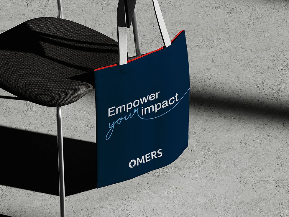
1 Modernized the visual identity
I helped evolve the OMERS brand into a more contemporary expression with stronger energy, clearer hierarchy, and a more current visual language. This mattered because the brand needed to feel more relevant to the audiences OMERS was trying to reach, especially future talent.
2 Connected brand evolution to talent attraction
The rebrand was not only about aesthetics. It was tied directly to employer brand goals and the need to attract high-quality candidates. This mattered because the updated identity needed to do real work in shaping first impressions and strengthening recruitment efforts.
3 Built a more usable system for internal teams
I helped create assets and structures that made the updated brand easier to apply across teams and channels. This mattered because a brand only creates consistency when people can actually use it without friction.
4 Improved speed and repeatability
The updated system helped teams create and deliver assets faster. This mattered because a more modern brand is only valuable at scale if it also improves operational efficiency.
5 Strengthened alignment across channels
The rebrand gave OMERS a more consistent way to show up across campaigns, internal communications, and outward-facing materials. This mattered because stronger alignment improves both credibility and day-to-day execution.
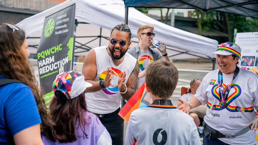
A concrete example
One of the clearest signs that the rebrand was working was how it translated across real applications. The updated system was used across recruitment materials, campaigns, presentations, and branded touchpoints, helping OMERS show up with a more modern and unified presence.
That mattered because the value of a brand evolution is not in the launch moment alone. It is in whether the work holds together across everyday use.


Results and impact
The work produced measurable improvements across both perception and operations:
-
20% increase in high-quality job applicants. This mattered because it showed the updated brand was helping OMERS appear more relevant and compelling to the talent it wanted to attract.
-
30% faster asset delivery. This mattered because the rebrand improved not just appearance, but speed and efficiency for internal teams.
-
Improved employer brand perception. This mattered because the organization needed to feel more current, purposeful, and competitive.
-
Stronger adoption across teams and channels. This mattered because the system was practical enough to scale beyond a launch campaign.
-
A more modern and consistent brand experience. This mattered because OMERS could communicate with greater clarity and confidence across touchpoints.
The bigger outcome was that the rebrand created a stronger foundation for how OMERS presents itself to employees, candidates, and external audiences.
Leadership and influence
My role in this work was not only creative. It was also connective. I helped bridge strategic intent, visual execution, and practical adoption across teams.
That meant translating brand ambition into systems people could use, helping stakeholders align around the direction, and keeping the work grounded in real organizational needs rather than design theory alone.
What made this project effective was not just the quality of the final expression. It was the fact that the updated brand could be understood, adopted, and extended by the organization.
Why this project matters
This project is a strong example of how I approach brand work: not as surface-level styling, but as a strategic tool for perception, alignment, and adoption.
The most meaningful part of this work was helping OMERS evolve its brand in a way that felt more relevant to future talent, more useful to internal teams, and more reflective of the organization it wanted to be.
Love it! Love the connection to our purpose. Thank you for bringing it to life.
Nancy Nazer, Chief Human Resources Officer, OMERS
Tony brings unmatched creativity, charisma, and audience instinct to every project. He listens deeply, adapts thoughtfully, and has a rare ability to inspire teams and turn ordinary ideas into something special.
Adam Amato, Director, Corporate Communications, OMERS

Showcasing OMERS' employee wellness program through stories from employees


Attracting OMERS' employee prospects with advancement opportunities


Learnings
This project reinforced that successful brand evolution is not about change for its own sake. It is about making the organization feel more like itself at its best: clearer, more current, and more compelling to the people it needs to reach.
It also reminded me that employer brand and design systems are deeply connected. A stronger visual identity can improve perception, but its real value comes from how well it helps teams communicate consistently and at speed.
“A brand becomes more valuable when it feels current to the outside world and easier to use on the inside.”